Graphic Design
Harbor House Collective
During my internship at Harbor House Collective, I took the lead on designing and producing a retail newsletter three times a week, as well as a weekly wholesale newsletter. These projects involved everything from layout design to content coordination and visual branding. In addition to the newsletters, I worked on a variety of other graphic design projects, gaining hands-on experience in both print and digital media while collaborating closely with the various departments involved in the production process.


Harbor House set out to develop a more thoughtful and accurate way to communicate the typical effects of their cannabis strains. While many brands continue to rely on the traditional sativa, indica, and hybrid labels, Harbor House recognized that nearly all modern strains are hybrids—and that genetic lineage alone often fails to predict how a product will actually make someone feel.
To address this, they created a unique effects-based system: Low Tide, High Tide, and Rip Tide. This system categorizes strains based on real-world feedback from both staff and customers, focusing on actual experience rather than outdated classifications.
I was responsible for designing a set of custom icons to visually represent each category, helping to make the system intuitive and engaging for consumers. These icons can be seen above and were designed to align with the brand’s coastal identity while clearly distinguishing the different effects categories.
Cake Walk Music

Hand-drawn on iPad, this graphic captures Cake Walk’s Music, a DJ duo's, playful energy through flowing, wave-like lines and a soft pastel palette. Each stroke echoes the rhythm and motion of the music — fun, fluid, and full of life.

Hand drawn cake on an Ipad with CakeWalk's name written on the top designed to look like icing,
Flyte Racquet Club

I redesigned the Flyte Racquet Club logo with the goal of elevating its brand identity to reflect a more high-end, luxury racquet club experience. I created a badge-style logo that incorporates clean, curved typography wrapped around the original emblem, giving it a refined and established feel. The updated design strikes a balance between modern sophistication and classic sports club aesthetics, aligning with the club’s elevated positioning.
Ask ChatGPT


Above are examples of membership collateral I designed for Flyte Racquet Club, including our membership application, which is shared with all prospective new members. I also created custom graphics to visually represent each type of Flyte membership. These icons, along with a membership comparison chart, are featured on our website to help users easily understand their options.
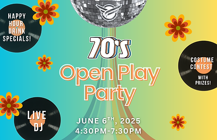
Designs for Themed Special Events at Flyte
.png)
These graphics were used for flyers, social media, promotional emails, and banner ads on the Flyte app.
.png)
.png)
.png)